Reds
(Permanent) Alizerin CrimsonQuinacridone RoseQuinacridone RedPerlyne RedSch BruinCadmium Red Deep ValueCadmium Red Medium ValueCadmium Vermilion/Cadmium Scarlet (PR – 108)
(Permanent) Alizerin Crimson
Quinacridone Rose
Perlyne Red
Sch Bruin
Cadmium Red Deep Value
Cadmium Red Medium Value
Cadmium Vermilion/Cadmium Scarlet (PR – 108) Information: opaque, lightfast Handling Characteristics: Saturated red with a shift towards orange when used purely and when mixed with other pigments.
Cadmium Vermilion is one of my favorite warm opaque reds to use. I feel as if I use this color in all my paintings in some form or another.
Like Cadmium red medium it mixes well with other colors, either in two color or three color mixtures, and can make beautiful skin tones. Personally, I find cadmium vermilion to be essential for glowing flesh tones.
Cadmium Vermilion is also important for mixing a variety of grays, when mixed with blues or greens the grays of silver and pewter are captured.
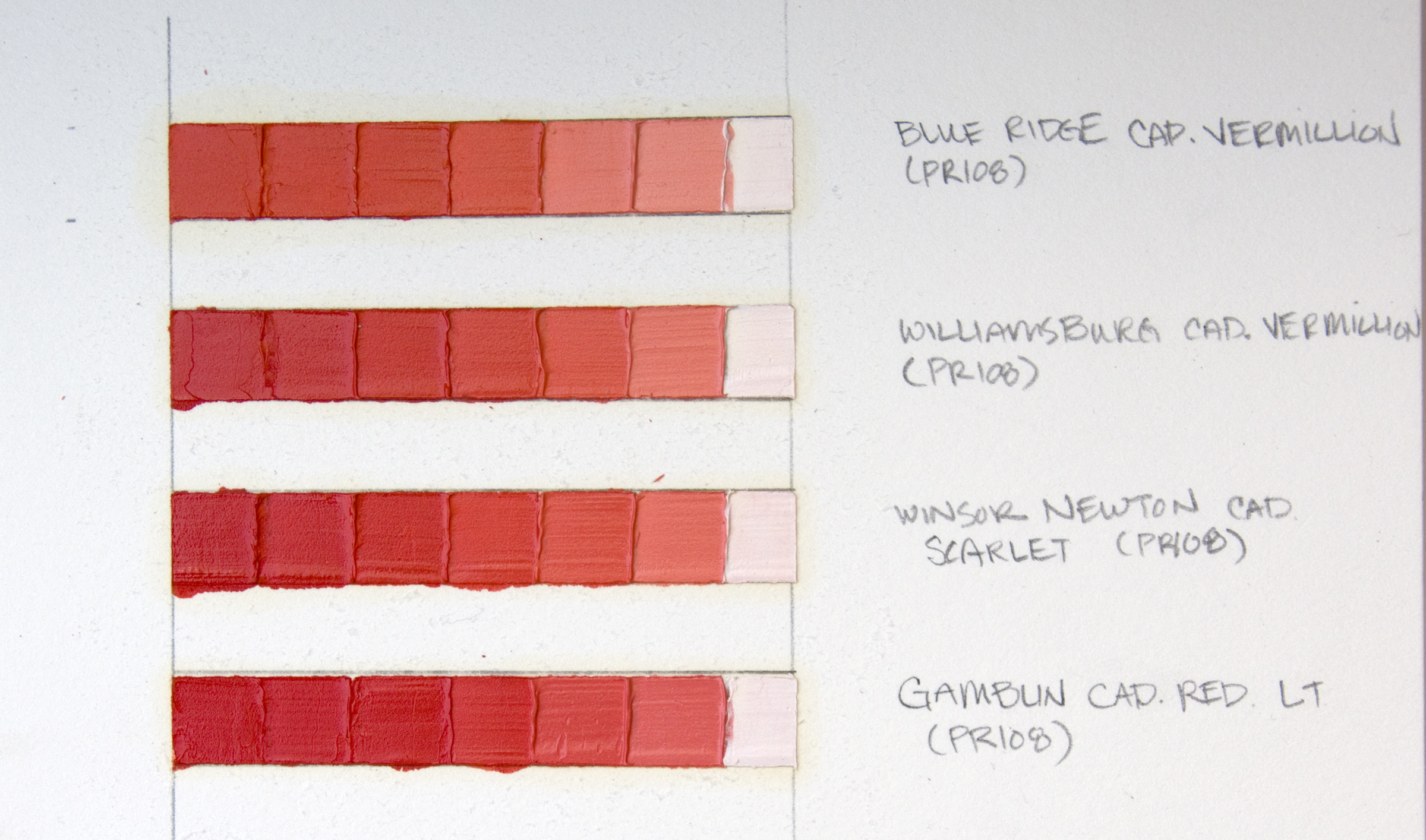
My experience with Cadmium Vermilion, sometimes called Cadmium Scarlet (PR 108), comes from using three different manufacturers’ versions. Each version is a range of warm, orange-ish, medium opaque red. You’ll see from my swatch card that in the fourth row I have included Gamblin’s Cadmium Red Light (PR 108) also. This is because Gamblin’s Cad. Red Light really falls in to the same spectrum as the Cadmium Vermilion examples.
Row 1: Name: Cadmium Vermilion (PR 108) Manufacturer: Blue Ridge Oil Colors My thoughts: Of this range of warm reds, Blue Ridge,s Cadmium Vermilion is one of my favorite oil colors to use. The first reason is because it is almost a spot on color of the red petals of an oriental poppy. Then also because it is so lush, and I particularly like how the color shifts to a pretty delightful salmon pink tone when mixed with whites. Also with this specific oil color, if you mix it down to a very, very light tint you are able to re-create the Old Holland color, Brilliant Yellow-Reddish, a color I used to always keep out on my palette until I realized it is so easy to mix with lead white and cadmium vermilion.
Row 2: Name: Cadmium Vermilion (PR 108) Manufacturer: Williamsburg Handmade Oil Colors My thoughts: the Williamsburg version of Cadmium Vermilion is another favorite of mine, it starts out more red than the Blue Ridge version, thus as it tints down it maintains a pink-ish quality, however there is still enough of a touch of orange in this color that makes it nice to work with.
Row 3: Name: Cadmium Scarlet (PR 108) Manufacturer: Winsor and Newton Artists Oil Colors My thoughts: During my first years of learning how to paint with oils, the Winsor and Newton Cadmium Scarlet was my orangey-red I kept out on my palette. It was the one my mentor, Danni Dawson, used and I did not switch until I began to be curious about other paint manufacturers and what they offered. After trying the Blue Ridge and Williamsburg versions, I quit using the Winsor and Newton one.
Row 4: Name: Cadmium Red Light (PR 108) Manufacturer: Gamblin My thoughts: I have not explored as much with the Gamblin color on this swatch card, however because I had some of this paint I wanted to place it in its place in relationship to my other colors.
Overall, it is a tossup for me in whether I choose to use the Blue Ridge or Williamsburg oil color. For several years I have been only using the Blue Ridge version, however when they had the fire in their factory a year ago and I ran low on my cadmium vermilion, I began using the Williamsburg version a bit more. I find if I start a painting with one version, I prefer to finish the painting with that version. I don’t switch back and forth between manufacturers when painting, especially if I am using the cadmium vermilion for flesh tones, it just becomes too tricky.
Here is an image of my original swatches I did of the cadmium reds and oranges before I began to make the graduated swatches. ....................................
These articles about my color palette and the oil colors I use are the result of my experience and continued exploration. I have purchased all oil colors on my own and I have not received any reimbursement from the mentioned paint manufacturers or art supply stores. The usefulness and perceived attributes expressed here in these articles are my personal opinions.


